
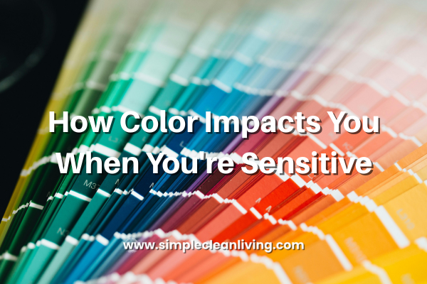
For sensitive souls, the world can feel loud even when it’s quiet. It’s not just noise or crowds that affect a sensitive nervous system; color plays a powerful role, too. The shades around us quietly communicate with our brain and body all day long, influencing our mood, energy levels, focus, and sense of safety. If you’re highly sensitive, empathic, or neurodivergent, color isn’t just aesthetic. It’s sensory input.
Understanding how color impacts your nervous system can help you create a home, wardrobe, and daily environment that feels supportive instead of overwhelming.
Why sensitive nervous systems react strongly to color
Our brains process color through the visual cortex, but the response doesn’t stop there. Color influences the autonomic nervous system, which controls stress responses, heart rate, and emotional regulation.
Sensitive nervous systems tend to:
• Process sensory input more deeply
• Stay closer to “fight or flight” mode
• Become overstimulated more easily
Bright, high-contrast, or overly saturated colors can feel activating or even stressful, while softer, muted tones tend to signal safety and calm.
Think of color as emotional background music. You may not consciously notice it at first, but your body always does.
Colors that tend to feel calming and supportive
Soft neutrals
Warm whites, cream, beige, greige, and light taupe create visual rest. These shades reduce sensory noise and give your nervous system space to breathe. They’re especially helpful in bedrooms, living rooms, and any place you rest or recharge.
Gentle greens
Green is often associated with nature, balance, and healing. Soft sage, olive, moss, and eucalyptus tones can help regulate emotions and reduce anxiety. These colors work well in kitchens, offices, or anywhere you want to feel grounded and steady.
Muted blues
Blue can be incredibly calming when it’s soft and slightly warm. Think dusty blue, pale denim, or blue-gray rather than bright or icy shades. These tones encourage relaxation and can support better sleep when used thoughtfully.
Earth tones
Soft browns, clay, terracotta, sand, and warm stone colors help the body feel rooted and safe. Earth tones are especially soothing for those who feel easily “ungrounded” or overwhelmed.
Lavender and soft purples
When muted and gentle, lavender and pale violet can feel comforting and emotionally soothing. They’re often associated with introspection and nervous system calm, but they work best when they’re subtle rather than bold.
Colors that may feel overstimulating
This doesn’t mean these colors are “bad,” but sensitive nervous systems may need them in smaller doses.
Bright reds
Red is energizing and activating. While it can increase motivation, it can also raise heart rate and anxiety levels. For sensitive people, too much red can feel agitating or exhausting.
Neon or highly saturated colors
High-intensity colors demand attention. Neon pinks, greens, yellows, and electric blues can overwhelm the nervous system quickly, even if they’re trendy or fun.
High-contrast combinations
Bold black-and-white patterns or sharp color contrasts can create visual tension, making it harder for sensitive brains to relax.
How to use color gently in everyday life
You don’t need to repaint your entire house or throw out your wardrobe. Small, intentional shifts can make a big difference.
Start with the spaces where you rest
Bedrooms, reading nooks, and quiet corners benefit most from calming colors. Soft bedding, curtains, or wall art can subtly support your nervous system.
Choose clothing that feels soothing
Notice how different colors feel on your body. Many sensitive people find they feel calmer in earth tones, soft blues, and gentle neutrals than in bold, attention-grabbing shades.
Use color in layers
If you love brighter colors, use them in small accents—a mug, a throw pillow, a piece of art—rather than as dominant features.
Pay attention to emotional responses
Your body is the best guide. If a color makes you feel tense, irritable, or drained, that’s valuable information. There’s no universal “right” color…only what feels supportive to you.
Simple living includes sensory simplicity
At its heart, simple living isn’t just about decluttering your home or eating whole foods. It’s about reducing unnecessary stress on your nervous system.
Color is one of the easiest, gentlest tools you can use to create a calmer life. When your environment feels visually soft and supportive, your body gets the message that it’s safe to slow down.
And for sensitive nervous systems, that sense of safety is everything.